« 5.2: Data Visualisation |
5.4: Dictionaries »
Lists of Lists
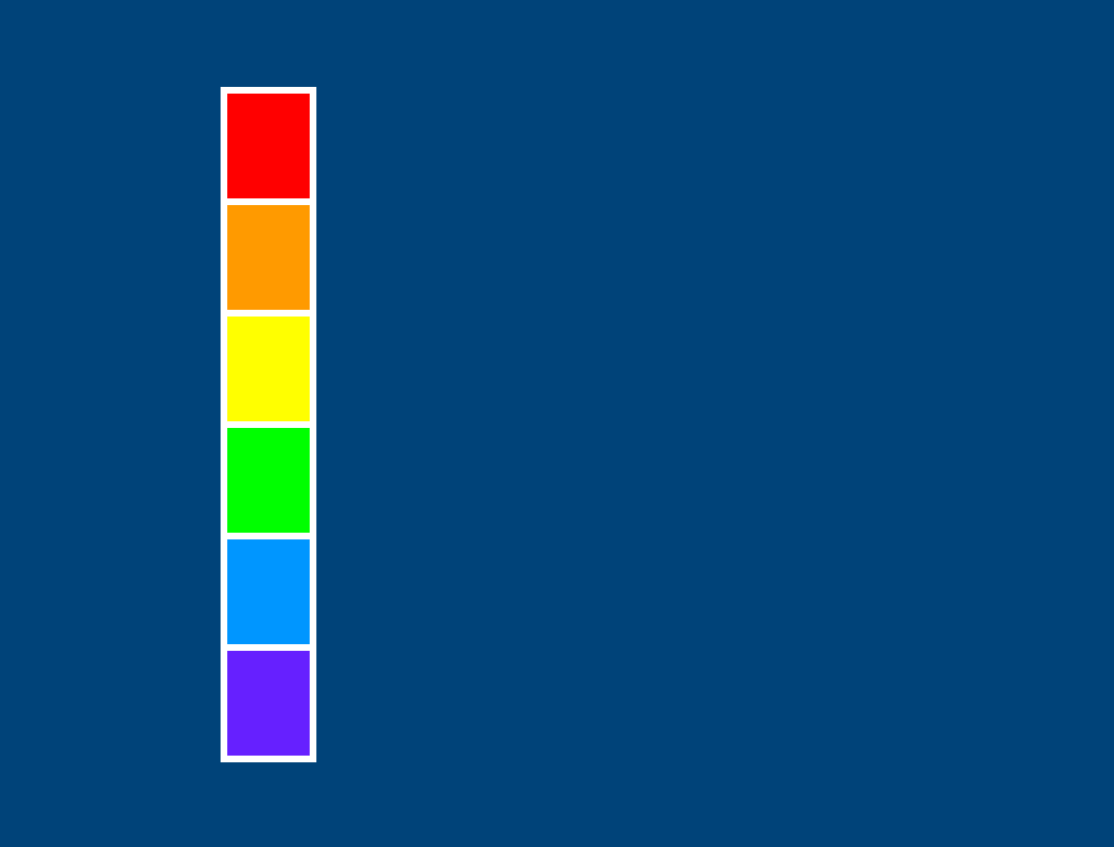
While this may seem complicated at first, appropriately nested lists make complex data sets easier to manage. In this practical exercise, you’ll create a bar chart; roughly speaking, something resembling the illustration below.

Create a new sketch and save it as “lists_of_lists”. Add the following setup code:
size(500,380)
background('#004477')
noFill()
stroke('#FFFFFF')
strokeWeight(3)

h = 50
translate(100,40)
This is the start of a rainbow-coloured bar chart. The h variable and translate() function define the first bar’s height and starting position, respectively. You’ll begin with some ‘0-dimensional’ data, working your way up to a 3-dimensional list as you progress. To begin, here’s a single integer value:
...
# 0-dimensional
bands = 6
rect(0,0, 40,h*bands)
Add the above code and run the sketch. The result is a vertical bar representing the number of bands in the rainbow sequence. If bands were equal to seven, the bar would extend beyond the bottom of the display window.

An additional dimension is required to describe the colour of each band. A 1-dimensional variable may be expressed as a list. Add the following lines to the bottom of your working code:
# 1-dimensional
bands = [
  '#FF0000',
  '#FF9900',
  '#FFFF00',
  '#00FF00',
  '#0099FF',
  '#6633FF'
]
To render the bands, include a loop statement:
for i,band in enumerate(bands):
    fill(band)
    rect(0,i*h, 40,h)
Run the sketch. The new strip is drawn precisely over the original bar but is divided into six blocks of colour.
The next step is to extend each block of colour, so as to form the horizontal bars. The width of each bar is to be determined by the brightness of its respective colour. To calculate brightness, one can add the red, green, and blue values together. For example, consider white – it’s the brightest ‘colour’ on your screen; is represented in hexadecimal as #FFFFFF; and if converted to percentages, is expressed as 100% red, 100% green, 100% blueThat’s an overall brightness of 300%, or if you prefer to average it out, 300 divide by 3 = 100%.
To manage the colours in as RGB percentages, one must substitute each hexadecimal string with a list of integers. The result is list of lists – a 2-dimensional array:
# 2-dimensional
bands = [
  [ 100, 0, 0   ],
  [ 100, 60, 0  ],
  [ 100, 100, 0 ],
  [ 0, 100, 0   ],
  [ 0, 60, 100  ],
  [ 40, 20, 100 ]
]
Add the code above to the end of your working sketch. To access a list element within another list, include a second pair of square brackets. For example, to retrieve the percentage of green in the second (orange) band, it’s:
print( bands[1][1] ) # displays 60Now, set the colorMode to use values between zero and one hundred, and add a loop to draw the bars:
colorMode(RGB, 100)

for i,band in enumerate(bands):
    r = band[0]
    g = band[1]
    b = band[2]
    sum = r + g + b
    avg = sum / 3
    fill(avg, avg, avg)
    rect(0,i*h, sum,h)
Run the sketch. The width of each bar is governed by brightness – that’s, the sum of the r, g, and b values. The bars are filled with greys to indicate the relative brightness of each colour.

Oddly, the green bar (fourth from the top) is equivalent in brightness/darkness to the red (top) bar. To recall, here’s a colour swatch of each:
This has to do with how the human eye perceives colour. We have a greater number of green receptors, so green light appears more prominent. There are ways to compromise for this, but for now, our averaging formula will suffice.
Adapt the existing loop, so that each bar indicates the quantities of primary colour that comprise it:
    ...
    b = band[2]
    #sum = r + g + b
    #avg = sum / 3
    #fill(avg, avg, avg)
    #rect(0,i*h, sum,h)
    fill('#FF0000')
    rect(0,i*h, r,h)
    fill('#00FF00')
    rect(0+r,i*h, g,h)
    fill('#0099FF')
    rect(0+r+g,i*h, b,h)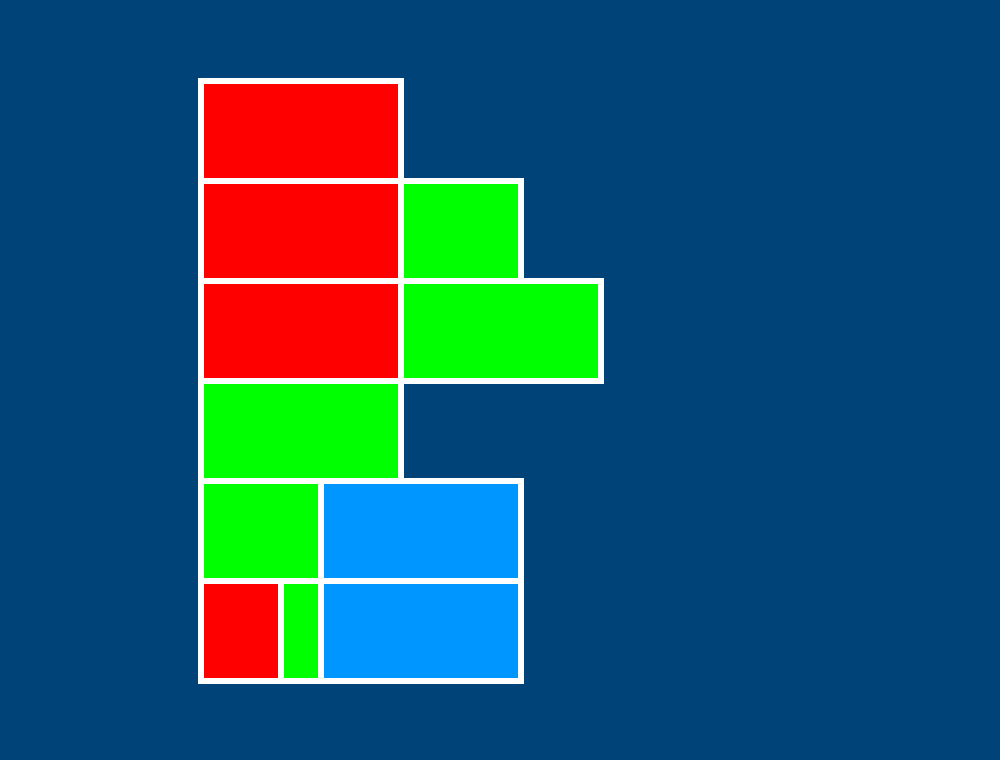
Labels will help elucidate things. To add some to the data set, one could go another list deeper, for example:
bands = [
  [ [ 100, 0, 0  ], 'red'    ],
  [ [ 100, 60, 0 ], 'orange' ],
  ...

print( bands[1][0][1] ) # displays 60
However, the above code just overcomplicates matters. Adding another dimension is overkill; a fourth element is all that’s required. Adapt your code as below:
bands = [
  [100, 0, 0, 'red'],
  [100, 60, 0, 'orange'],
  ...

for i,band in enumerate(bands):
    ...
    fill('#FFFFFF')
    textAlign(RIGHT)
    text(band[3], -20,i*h+30)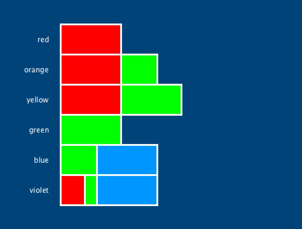
Many lists work just fine with a single dimension – take, for instance, a shopping list. You can think of a two-dimensional list as a grid or table. This makes them useful for plotting 2D graphics. Three- and other higher-dimensional arrays have their place, but before employing such a structure, consider whether adding another position to your 2D array may be more sensible.
Breakout Task
In this challenge, you’ll recreate a Breakout level. Some code will be provided to work with, and this will include a three-dimensional array. Working with such a list requires a nested loop – that’s, a loop inside another loop.
Create a new sketch and save it as “breakout”; then, copy-paste in the code below:
size(600,600)
noStroke()
background('#000000')

# ball and paddle
fill('#FFFFFF')
ellipse(350,440, 18,18)
rect(300,520, 190,40)

r = '#FF0000' # red
o = '#FF9900' # orange
y = '#FFFF00' # yellow
g = '#00FF00' # green
b = '#0099FF' # blue
p = '#6633FF' # violet

bricks = [
  [ [0,r,1], [1,o,1], [2,y,1], [3,g,1] ], # row 0
  [ [0,o,1], [1,y,1], [2,g,1], [3,b,1] ], # row 1
  [ [0,y,1], [1,g,1], [2,b,1], [3,p,1] ], # row 2
  [ [0,g,1], [1,b,2], [2,p,2], [3,b,1] ], # row 3
  [ [0,b,1], [1,p,2],          [3,g,1] ], # row 4
  [ [0,p,1],                   [3,y,1] ], # row 5
  [                            [3,o,1] ], # row 6
  [ [0,g,1]                            ]  # row 7
]
In an attempt to make the code more readable, the bricks list has been typed-out in a fashion that reflects the visual positioning of each brick. In the following order, each brick contains a: column-number; fill-colour; and hit-count (indicating how many hits are required to destroy it). Take the first brick as an example:
[0,r,1]The brick is positioned in column 0, has a fill of red, and requires one (remaining) hit to destroy. Of course, one can infer the row position from the list in which the brick resides. Add two print() statements to confirm this information:
...
print( bricks[0] )       # displays the first row of bricks
print( bricks[0][0] )    # displays the first brick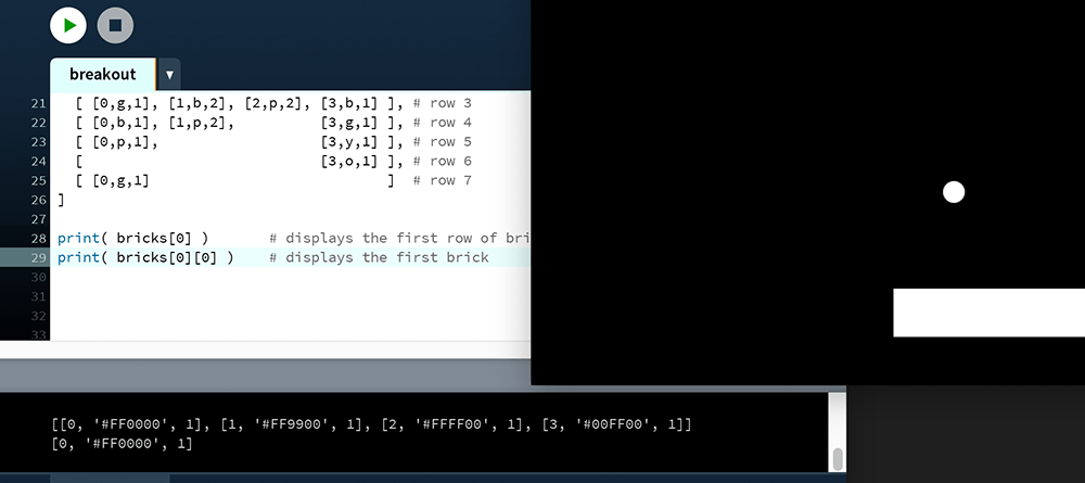
Should you wish to retrieve the colour of the first brick, it’s:
print( bricks[0][0][1] ) # displays #FF0000Now, you must complete the task as per the result below. Bricks with a hit-count of 2 have a shine effect.
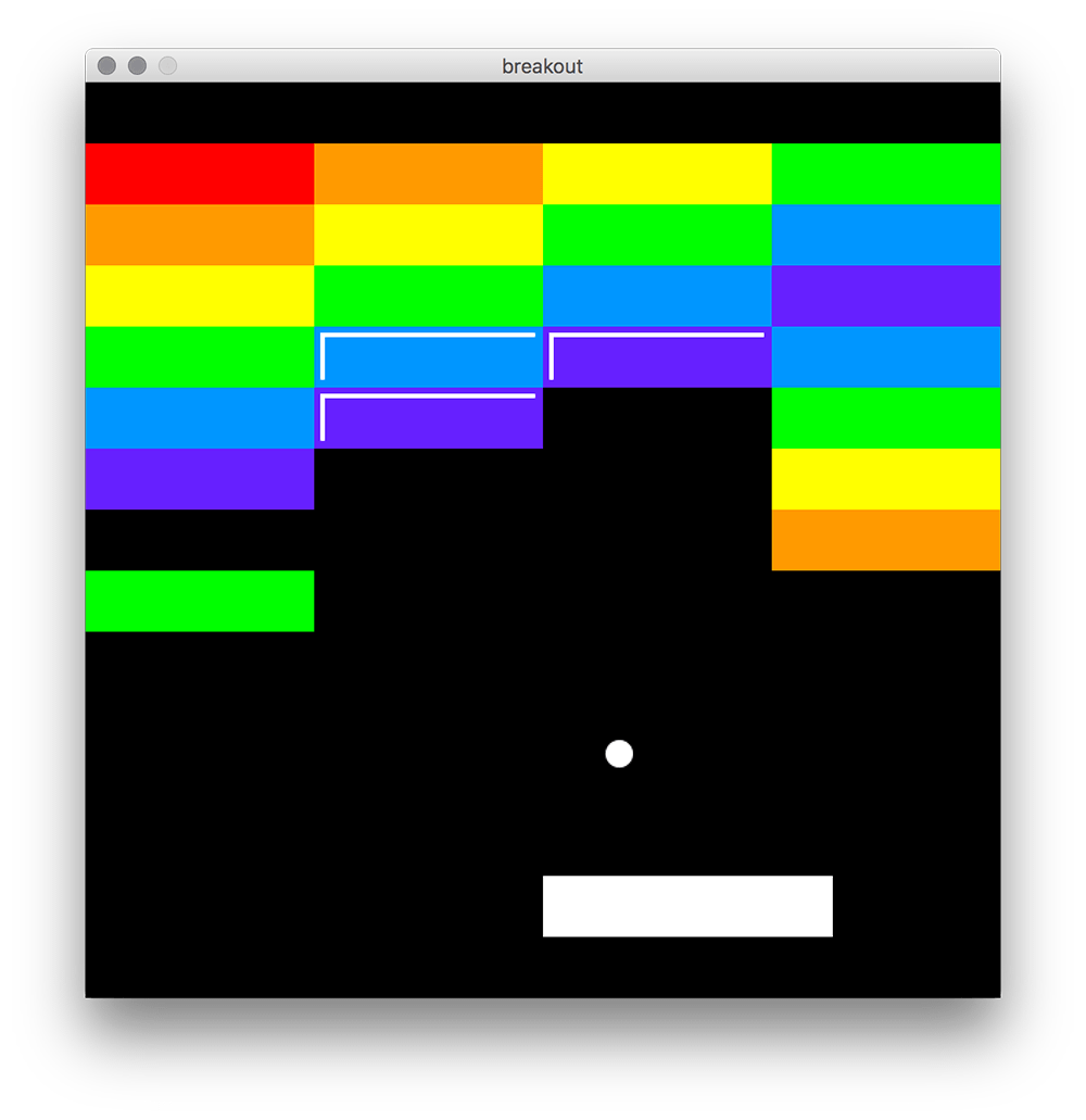
As mentioned already, you’ll need to employ a nested loop. If you are stumped, perhaps these few lines will get you going?
for row,bricks in enumerate(bricks):

    for brick in bricks:
        x = brick[0]*150
        ...
If you are more comfortable with a range() style approach, that should work fine too.
5.4: Dictionaries »
Complete list of Processing.py lessons