« 5.1: Lists |
5.3: Lists of Lists »
Data Visualisation
Data visualisation is a recurring theme in these lessons. It relates neatly to a lot of the coding content and makes for some intriguing – and often, enlightening – visual output. Writing Processing code provides you with full control over visual output, so you’re longer limited to whatever Excel can conjure. Instead, you get to explore novel ways to visualise data – ranging from highly abstract (like something you’d see in an art gallery) to highly informative, or anything in between.
At various points, you’ll be provided brief introductions to useful ‘data viz’ concepts. Lists-of-lists are a means of managing multidimensional data, so now seems an opportune time to review the role of dimension in data visualisation. Before moving onto writing any code, though, we’ll look at a hypothetical scenario demonstrating how list data translates into visual output.
Introduction
Computers are remarkably efficient data processing tools. It’s not surprising to discover that VisiCalc, a spreadsheet application released in 1979, is considered the world’s first killer application. Killer applications lead consumers to adopt new hard- or software platforms. Video game examples include the Atari 2600 port of Space Invaders, which the quadrupled console’s sales. Tetris is credited as the Nintendo Gameboy’s killer app and to date remains the product line’s top-selling game of all time.
Email is another killer app, albeit more of a messaging protocol. Before email, many people felt they didn’t need an Internet connection, or even a computer for that matter. Shortly after email went mainstream, web browsers converted many remaining online holdouts. Websites have been tracking visitor traffic since the early days of the Web. Nowadays, smart devices gather information from machines, animals, and people. We gather ever vaster quantities of data, yet much of it remains unused. Data visualisation presents opportunities to better utilise it – conveying concepts in a more accessible manner and even providing inputs to experiment with different scenarios.
Raw data is typically structured in a tabular type arrangement. It can be handwritten or captured electronically (CSV files, databases, etc.), but ultimately, can be dumped into a spreadsheet without too much hassle. However, scrolling through endless rows and columns is hardly an effective or engaging approach to analysis. Graphs help by presenting data more insightfully, also making it easier to present findings to others. Lotus 1-2-3, VisiCalc’s usurper, introduced several graphing features, which have been common spreadsheet fixtures ever since. If your spreadsheet software lacks the chart you need, you’ll likely find an app/web-app or programming library suited to the task. Plotly and matplotlib are well worth exploring.
Visualising Tetris Scores
In this section, we’ll be analysing some gameplay data. The focus is the visualisation of this data. There’s no need to write any code, but you’ll need to read through some. In the next section, you’ll apply this theory in Processing.
In 2010, the inaugural Classic Tetris World Championship (CTWC) took place in Los Angeles, California. The organisers opted for the NES (8-bit Nintendo Entertainment System) version of Tetris, played on original hardware connected to a CRT television screen. The event has run annually ever since, although the venue has moved to Portland, Oregon. In 2017, one could qualify with a score of around 500,000. Now, suppose you wished to enter the upcoming CTWC. You’ve bought a console, cartridge, and CRT television, and have trained for months. However, your high scores seem to have plateaued. To help analyse and (hopefully) improve your scores, you decide to visualise your performance using Python.
To begin, you create a list containing all the dates you’ve played.
dates = [ 'Jan 28', 'Feb 04', ... ]You then write some code that plots these values along a single axis labelled “Date”.

From this one-dimensional plot, you can determine how frequently you play. For a solid blue line of dots, you’d have to have been playing daily. There are significant gaps on either end (you purchased the equipment in late January; now it’s almost mid-May) as well as irregular intervals of non-play, but more prominently so towards the start. On average, you are playing around six days a month, and this is increasing. Statisticians would refer to this as an example of univariate analysis because we are concerned with a single variable (the dates you’ve played). Such analysis is useful for describing features like central tendency (mean, median, mode) and dispersion (range, variance, standard deviation).
Bivariate analysis is the simultaneous analysis of two variables; this helps identify relationships (if any) between them. In this instance, we’ll explore the correlation between dates and scores.
You decide to add another dimension to your list (a list in a list) so that each element contains two values: a date, and the highest score you accomplished that day. Think of it like this: you added a (“score”) dimension to your data that’s now mirrored in your code. Programmers will often refer to 1-dimensional, 2-dimensional – or other higher dimensional – lists to describe the formations of multidimensional arrays.
scores = [
  ['Jan 28', 120000],
  ['Feb 04', 80000],
  ...
]
To visualise this, you must add a dimension to your plot. You elect to use a scatterplot, placing each dot against a horizontal (“Date”) and vertical (“Score”) axis.

It would appear that playing more frequently leads to more erratic high scores. Perhaps, what is most noteworthy, is that you perform best after stretches of no play (about week’s break). The good news is that your all-time high scores do seem to be improving.
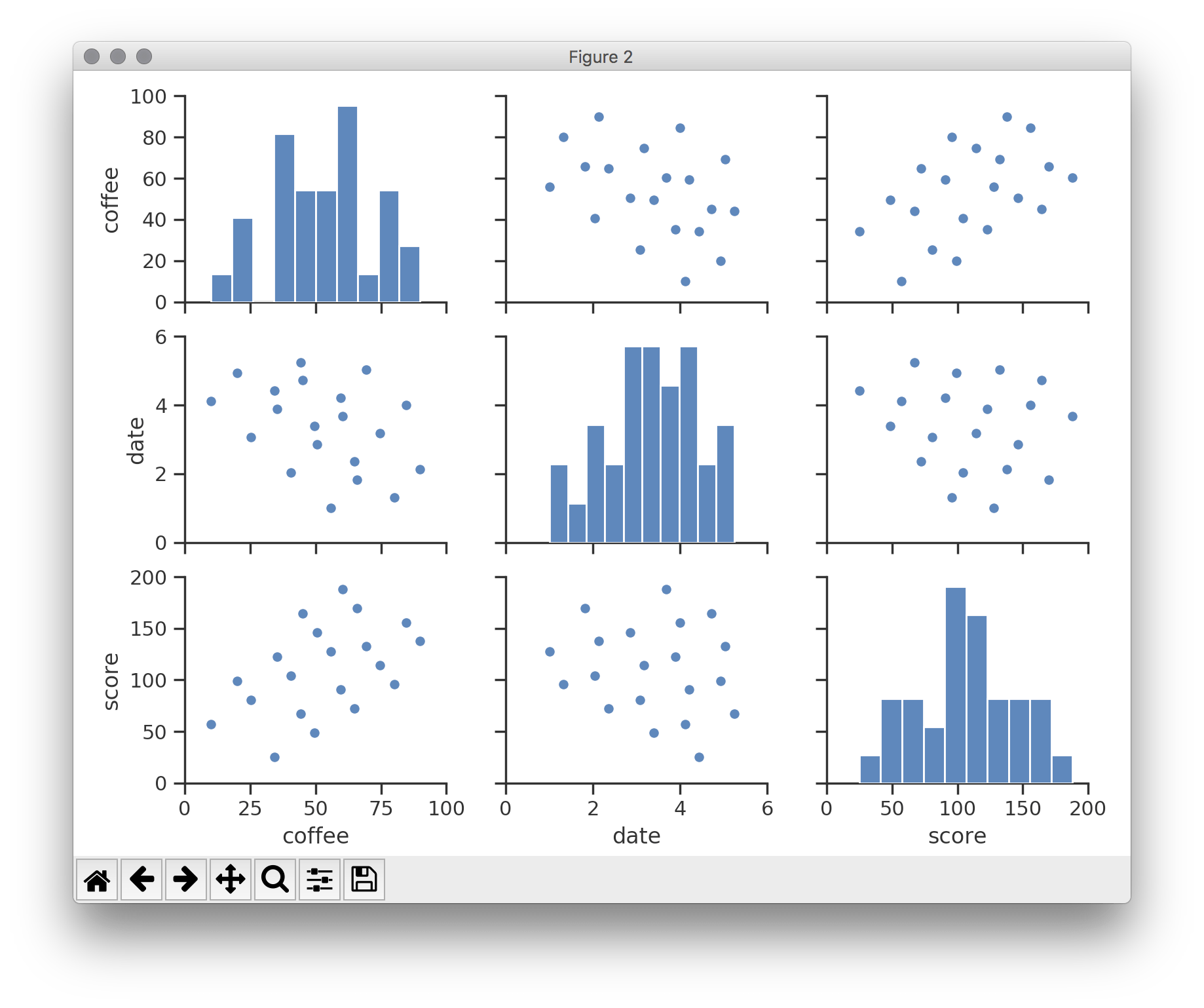
You’ve recorded a lot of data – including the time of day, environmental factors, and more … most of it superfluous – but while poring over these details you realise that there may be a third variable in play: coffee. You add another value to your sub-lists; this is analogous to adding a column to an existing spreadsheet or table. The additional value indicates how many millilitres of coffee you drank (up to 2 cups, or 500ml) before posting a high score for that day.
scores = [
  ['Jan 28', 120000, 220],
  ['Feb 04', 80000,  260],
  ...
]
To visually accommodate the new coffee values, one can simulate depth. You add a third (“Coffee”) axis to the scatterplot.

Some interesting diagonal patterns have appeared, but gauging the positions of the dots is tricky. Moreover, should the data grow more multivariate – i.e. another variable is introduced – you face the problem of having to visualise a fourth spatial dimension. But, there are other visual notions to leverage. Consider, facets. Imagine the three-dimensional scatterplot as a cube (six-sided) with transparent walls. If you held it in your hand, it could be rotated to reveal a distinct graph on each side. Now, suppose that you ‘unfolded’ this cube and it laid flat, then separated each facet and arranged them on a grid. The result is a scatterplot matrix – or, acronymically, a SPLOM.

A three-dimensional SPLOM is three rows wide and three columns high. Should you wish to add further variables to the data set, the matrix can expand to accommodate them.
Sigbert [CC BY-SA 3.0], from Wikimedia Commons
Facets are but one notion, though. Size is another option. You decide to revert to the two-dimensional scatterplot, then represent the “Coffee” dimension by adjusting the size of each dot accordingly.

However, each does not have to be circular. By including a variety of different shapes, one can convey even more information. Then, there’s colour. Your friend Sam – who is also an avid coffee drinker – plans to enter the tournament, too. To compare your progress, you plot Sam’s scores in orange.

Alas, in focussing on visualisation we have drifted away from code snippets. So, how exactly would one structure a Python list to accommodate the scatterplot above? One approach is a 3-dimensional list:
scores = [
  # your scores
  [
    ['Jan 28', 120000, 220],
    ['Feb 04', 80000,  260],
    ...
  ],
  # sam's scores
  [
    ['Feb 07', 145000, 150],
    ['Feb 09', 80100,  170],
    ...
  ]
]
In this way, each player is a list element containing other nested lists. To return to the spreadsheet analogy: instead of adding another column, you’ve added a new sheet – that’s, one sheet for yourself and one for Sam.
Now look at a 2-dimensional alternative:
scores = [
  ['me', 'Jan 28', 120000, 220],
  ['me', 'Feb 04', 80000,  260],
  ...
  ['Sam', 'Feb 07', 145000, 150],
  ['Sam', 'Feb 09', 80100,  170],
  ...
]
In the three-dimensional version, your lists had been contained within one element, and Sam’s within another. Now, each entry must include a name. The result is a lot of repetition. Less repetition is usually better.
If you really wanted to give yourself a headache, you could opt for a 1-dimensional list:
scores = [
  'me', 'Jan 28', 120000, 220, 'me', 'Feb 04', ...
]
Values within the same category are now placed four positions apart from one another. Sure, you could write some loop that works with this … but, eeew! Right?
Interestingly, the number of dimensions you express visually does not always reflect the number of dimensions that comprise your list. In fact, it’s advisable to avoid using anything beyond a three-dimensional list. To return to the spreadsheet analogy one last time: consider adding another column to your existing sheets instead of creating more spreadsheet files.
Effective data visualisation requires the application of art and science to represent multidimensional information structures within two-dimensional visual displays. These displays could be sheets of paper or computer screens. Additionally, though, screens cater to time. As an example, charts and figures can animate while you view them. Using mouse, keyboard, touch, speech, gesture and other input, viewers can explore data in an interactive fashion. For some inspiration, take a look at Fathom’s project showcase. Ben Fry, the principal of Fathom, is also one of Processing’s co-developers.
5.3: Lists of Lists »
Complete list of Processing.py lessons