This post discusses the concepts around measuring differences in colour, particularly in the RGB colour space.
Introduction
I recently developed a prototype system for automatically assessing vector graphics drawing tasks – basically: you download a raster graphic; re-draw it using your preferred vector graphics software (Illustrator, Inkscape, or CorelDRAW); and then upload it once you’re done. Your rendition is then compared to the original and you receive a score for your efforts. Hence my investigation into this topic, as, in addition to comparing the coordinates and dimensions of various shapes, the assessment algorithms are also required to compare the accuracy of fill and outline colours.
Note that throughout this article, Excel formula notation has been used instead of mathematical notation.
Colours for Digital Displays
Before proceeding, here’s a basic introduction to how computers (and screens in general) display colour. You may already know about a bit this topic, but if you don’t, this is the gist of it: every pixel of colour that you see on your screen is displayed by mixing together three primary colours – much like how you mixed red, yellow, and blue paint in art class. However, your screen relies on red, green, and blue instead. Furthermore, as light blends colour in an additive fashion, pixels combining all primaries at full intensity appear as white. Conversely, a complete absence of any colour results in black. Other colours contain varied quantities of red, green, and blue. For example, a bright red would be:
red: 100%
green: 0%
blue: 0%
A darker red could be represented as:
red: 50%
green: 0%
blue: 0%
Following the same red-green-blue sequence (RGB), black is [0,0,0], white is [100,100,100], blue is [0,0,100], yellow is [100,100,0], and so forth. These values are often represented in hexadecimal, where 100% is described as FF – but this article avoids any hexadecimal representations.
Distance
Distance can be defined as the length of the space between two points. In this case, those points happen to be colours, and the range of space the colours can occupy is referred to as a gamut. Certain media offer wider gamuts than others. For example, if you print this page, these two colour swatches will appear far more alike on paper – if not identical – than on your screen:
The average printer cannot reproduce the bright green (left) swatch. Thus, one can say that the screen’s bright green is out of gamut in the printer’s (CMYK) colour space.
One Primary Colour
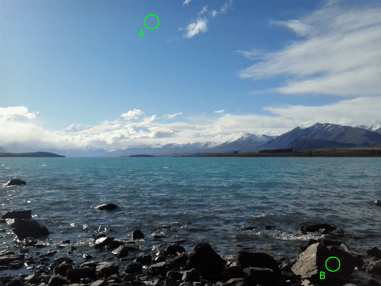
To begin measuring distance between colours, consider an image rendered using a single primary colour, rather than three. It’s probably easiest to use a single black primary, just like a grey-scale printer does. So, [0] black results in white; whereas [100] is the darkest possible black; everything in-between is some shade of grey. In the image below, point A has a black value of 40 and point B a value of 95.
So if one were to plot points A and B along a scale, it looks something like this:

If you want to calculate a distance between the two colours, simply take B and subtract A from it, which in this case is:
95 - 45
which equals 50.
So the smaller the value, the closer the match; whereas a value of zero indicates that the colours are identical.
Two Primary Colours
Now consider an image in which all of the colours are mixed using two primaries – such as a duotone graphic. Below is a sepia duotone of the same photograph:
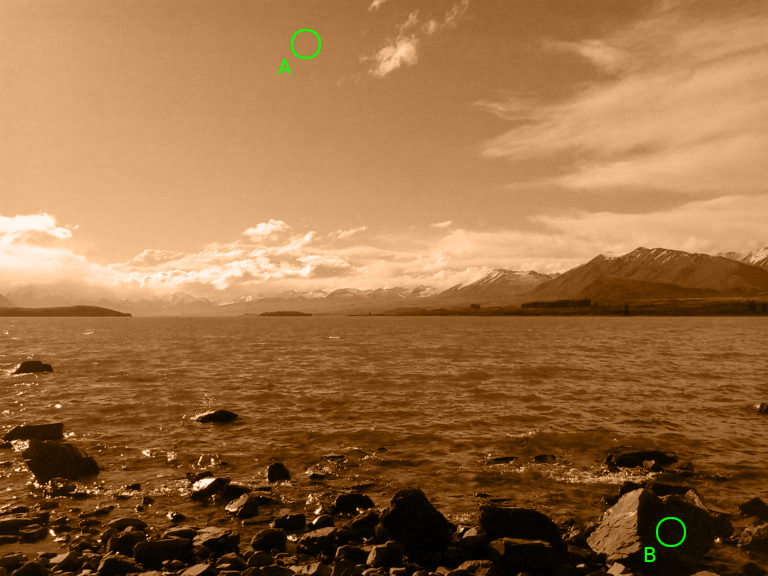
Rather than measuring the distance in one dimension, the values must now be plotted in two dimensions – one for sepia and one for black. In order to measure the distance one must employ the Pythagorean theorem and use the length of the hypotenuse to indicate the distance between the two points:

Therefore, the distance (the black dashed-line) between colours A and B is calculated as:
SQRT( (90-30)^2 + (50-35)^2 )
which equals roughly 62.
This same concept can be extended to accommodate full-colour images.
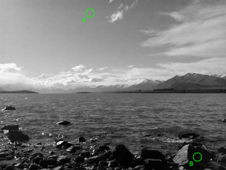
Three Primary Colours
It has been established that screens display full-colour graphics using three primary colours, namely red, green, and blue. In the image below, the RGB values for points A and B are equal to [30,50,70] and [5,0,5] respectively:
An additional third dimension is now added to the graph, as visually illustrated in the diagram below:

A right-angled triangle can be drawn between points A and B. Mathematically speaking, an extra dimension has been added to the Pythagorean theorem, so the distance is now calculated as:
SQRT( (30-5)^2 + (50-0)^2 + (70-5)^2 )
which equals roughly 86.
More correctly speaking, this distance is referred to as Euclidean distance – and there are no limits to how many dimensions can be added using the formula. So, it would seem that Euclidean distance is a measure of how similar two colours are … but it’s a bit more complicated than this …
The Human Visual System (HVS) Model
When taking into account differences in colour, one has to consider the apparatus. For humans, this is a combination of the eyes and brain. To assist in hardware and software development, experts in the field of computer graphics have devised the HVS Model. By modelling how humans visually perceive the world around them, they are able to optimise how devices handle and render graphics. As an example, JPG compression can dramatically reduce the file size of digital photos by discarding colour information – yet there’s little to no discernible difference to the HVS. Of course, heavier JPG compression does produce a more noticeable loss in quality, but high-quality JPGs are difficult to discern from an uncompressed original. One technique JPG compression relies upon is Chroma subsampling which takes advantage of the HVS’s lower acuity for detecting differences in colour than differences in brightness (or more correctly, luminance).
Visual Acuity
There are other compression techniques that advantage of how the HVS operates. To explain another concept, observe the two swatches below. Which is brighter?
Maybe removing the gap will help? Still unsure?
The correct answer is … the right swatch. Although both swatches contain no red or green, the right swatch has 1% less blue in it. As a test, I took a screenshot and zoomed well into the centre boundary of the gap-less version; there indeed was a difference, albeit a barely discernible one. Now imagine an image that contains both of these colours alongside one another, and possibly interspersed amongst other colours. The image effectively contains more information than the HVS can truly discern. One colour will suffice, so compression algorithms, such as those used in GIF and PNG, reduce the file size by reducing the number of colours in the image – or this case, discarding one of the blues in favour of a single shade.
Delta E
Delta E (or ΔE, or dE) is the measure of change in visual perception. The earliest Delta E formula was simply a Euclidean distance calculation. However, the Commission Internationale de l’Éclairage (CIE) has extended upon and refined it (numerous times) to improve accuracy. For instance: the RGB colour space is not perceptually uniform, so the Euclidean distance formula changes from:
SQRT( R^2 + G^2 + B^2 )
to:
SQRT( 3(R)^2 + 4(G)^2 + 2(B)^2 )
This is because the HVS is more sensitive to certain colours due to the physiology of the eye – which contains a greater number of green receptors, than it does red or blue. But, one can compensate by adjusting the formula, factoring in the correct RGB ratio by multiplying the green value (G) by four, making its effect the most prominent. Similarly, The red (R) value is multiplied by three; and the blue (B) by two.
It gets more complicated, though, and further adjustments must be made to accommodate for – among other considerations – the fact that changes in darker colours are less noticeable than those in lighter colours. And this is where the article ends; and where you can head over to Zachary Schuessler’s Delta E 101 webpage. Zachary does an excellent job of explaining Delta E further, and also provides the CIE’s algorithms implemented as a JavaScript library.
End
References
- https://www.researchgate.net/publication/236023905Color_difference_Delta_E-_A_survey
- http://zschuessler.github.io/DeltaE/learn/